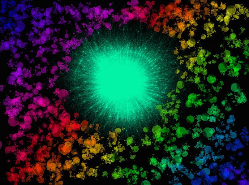
Hey whatsup! My name is Irene and I am 14, in grade 8. My dad is Belgian and My mom is Filipino. I was born in Singapore and lived in Singapore my whole life. This is my second year in UWCSEA Dover. I have a younger sister and used to have 2 guinea pigs. I play the piano and the guitar, electric and acoustic. I like music, all types. The artwork you see is something I made on the computer. I made it like this because I like the color scheme and abstract. And I also feel like this artwork kind of shows my personality, because i am a very colorful person and have mixed personalities depending on my mood, but I am mostly fun, friendly and outgoing. Also this artwork didn’t really take me too long, but a fair amount. I really like all of your artworks and hope maybe we could be friends if not acquaintances. I would also love some feedback from you. :)
Hey Irene!
ReplyDeleteYour artwork looks amazing. When I was scrolling through the page, your artwork caught my eyes the most! I love the abstractness of the whole artwork as one! It must take a lot of skills to be able to make such a nice piece of work.
How did you make this amazing piece of work?
I would love to learn how to do this so I could make such a nice piece of work one day!
This looks like a very nice piece of artwork overall but do you think you could add more?
You could have made it more abstract by making dots dramatically apart from one another in certain places and also with the sizes the dots are.
Overall this was very nice to look at and you seem like a very kind person from your description!
Sammy
Hey Sammy H,
DeleteThanks for the feedback! I will use it in the future :) I made this on a website called Deviantart, But you would need and account (which is free) Once again thank you for commenting on my artwork. :P
Hi Irene! My name is Elly. Your artwork is awesome! I love how you incorporated all of the colors and how they work well together. Also, I like how the bright green in the middle stands out and draws the viewers eyes to it.I agree, the color scheme and abstract is really shown in this piece. I also like how you did this piece on the computer, why did you choose to do that? Good job!:)
ReplyDeleteHey Elly K,
DeleteThanks for the comment :)
The story of me doing this artwork is because I was on my laptop on this website called Deviantart when I decided to make this, I am not sure what inspired me to do this, but thats just me :P
Hey Irene, this is Simr. I'm 13 years old and I go to grade 8 in the American School of Abu Dhabi. I was browsing through all this blog when your artwork caught my eye. It's colorful and abstract and it's very interesting. I like art but I've never made it on a computer. Which software did you use? I would like to try making this type of artwork sometime. I will enjoy seeing more of your great artwork :)
ReplyDeleteHey Simr S,
DeleteThanks for the comment :) And the thing I used to make that is this website called Deviantart, but you will have to make an account. Don't worry it's free :D Can't wait to show you more of my artworks too. :)
This comment has been removed by the author.
ReplyDeleteHi, Irene! It's Charlotte (ACS). I love your piece! The black backgroud really brings out the colors. What were the colors meant to represent? I find it's similar to an explosion. The bright green "bomb" in the center really draws the viewer's attention. I've never made artwork on the computer- is it difficult? Nice job on this piece! Awesome!
ReplyDeleteHey Charlotte,
DeleteThanks for the comment :) I guess the colors are supposed to represent my different personalities, or that I colorful things. Artworks on the computer can be hard depending on what you want to make, or if you have the right tools. If you want to draw something realistic it would be easier to use a drawing pad instead of the mouse.
Plus I never thought of it as an explosion or a bomb. Cool imagination bro :)
DeleteHello Irene,
ReplyDeleteI love your mix of color in the art. I would suggest to make the sonic light more to the center. It seems to be more towards the top side so you could push it down a bit and it seems to be towards the left side. Also, why is the sonic light blue specifically? Is it supposed to signify something? Other than that, I love your artwork! It is very good and I love the flow of colors - you should be very proud!
Hey Reina,
DeleteThanks for the feedback :D I will defiantly think about it when I make something else. I guess the color of the 'sonic light' doesn't really have a specific reason why it's that color. And no I don't think it signifies anything really.
Thanks for the comment :)
hey Irene!your art work look great! and i like the way you draw the central part,and the technic you use to draw the side-part. I really like you use the color cleanly, then separate all the color that you used. i will love to learn how to use this technic.
ReplyDeleteThis looks like a very nice piece of artwork overall but do you think you could add more?
maybe you can try a other way to do the side-part, like from central to the sideline.
Overall this was very nice to look at !
Hey Emma Yu,
DeleteThanks for the comment :) I didn't really think of why I made the patters diagonally. But I think I would like to go and experiment different ways to make it. Thanks for the idea. Also im not sure what else to add to this, I didn't want it to look too full of too plain.
Hey Irene, you artwork caught my eye when I was scrolling - it so colorful and abstract, I really liked it. I liked your choice to make the background black, it really made the colors pop. Why did you choose to make the centre green? This artwork is amazing, good job!
ReplyDeleteHey Kaitlin J,
DeleteTo be honest I don't really know why I made the centre green, I guess I liked the way it stood out from the black background. Anyways thanks for the comment :)
Hey Irene, awesome image, love the color everywhere. Which programs did you use? Also, did you have and idea or message in mind when making it, or did you just make it? I feel like the middle part is really groovy, I think you should make an artwork just based on that design.
ReplyDeleteHey Alex B,
DeleteI used a website call Devientart, but you would need an account for it( don't worry its free) I didn't really have an idea or message when making this, but I think I could give a reason. I think it kinda shows my personality because I have so many (but mostly fun, outgoing and happy) I guess thats why it's kinda based of a rainbow. Anyways thanks for the comment :)
Hi Irene,
ReplyDeleteI really like this image, its eye catching, because the colours really stand out against the black background. I love how the outside colours blend into a spectrum. What computer program did you use for this, and did you learn to do this alone?
Hey Tanya,
DeleteThanks for the comment :) I used a website call Devientart, but you would need an account for it( don't worry its free) I did learn how to do this on my own by just playing around with different things until I got the hang of it, then produced this :P
This comment has been removed by the author.
DeleteHi Irene,
ReplyDeleteI really like this image, its eye catching, because the colours really stand out against the black background. I love how the outside colours blend into a spectrum. What computer program did you use for this, and did you learn to do this alone?
Hi Irene, I'm Laura:). I love your art work, I like how it looks like an explosion, and the contrast of colors. What was it meant to look like, why did you make this, how did you do this? i think you should consider making the rainbow looking less like stripes. I look forward to more of your art .
ReplyDeleteHey Laura,
DeleteThanks for the comment :) Im not 100% sure what it is supposed to look like and why I made it like that, but I did make this on a website called Devientart. And also thanks for the feedback! I will keep that in mind :D
Hey Laura,
DeleteThanks for the comment :) Im not 100% sure what it is supposed to look like and why I made it like that, but I did make this on a website called Devientart. And also thanks for the feedback! I will keep that in mind :D
Very nice abstract art. I like the colour of the background and how the green spot matches with it.
ReplyDeleteThanks for the comment :)
ReplyDeleteThanks for the comment :)
ReplyDelete